I'm very excited to talk about this topic because as some of you know I studied graphic design at University and after creating so many brand identities for fake business during my studies, it was a real treat to be able to work for myself and create a jewelry brand design of my own.
For those of you who aren't sure what a brand identity is; it's the collection of all visual and non-visual elements that a company creates to portray the right image to its audience. It represents how a brand wants to be perceived in the market and includes everything from its logo, color scheme, typography, and messaging to its overall tone of voice and customer experience.
My professor couldn't stress enough that a company's brand identity isn't simply the logo, but it's the face of the brand. It conveys the essence of your brand to the audience. So pretty important stuff!
I will walk you through the process of creating Wander Jewellery's brand identity and give you a few tips that might come useful if you're working on a similar task.
Step nº1
Focus on the imagery and iconography. You can start by brainstorming some words that represent your brand. For example, in my case, the keywords were: handmade, personal brand and Bohemian style. Focusing on these words, I tried to think of figurative images that would represent those words. You don't have to be logical about it. If your business sells pastries, your imagery doesn't have to be composed of cupcakes or cakes, you can be creative about it.

In my case, the image that came to mind, is a dear symbology: the hand of fatima. The main reason being, that I grew up in Egypt where it was a common good luck souvenir for tourists even though it hides a deep and religious meaning across different cultures. As I wanted to give a personal touch to the brand, the iconography of something familiar, that reminds me of my childhood home seemed like a good way to go. The link to handmade seems pretty obvious as well.
Step nº2
Choose a color palette that evoke specific emotions. It's a good idea to remain cohesive to your initial keywords. What colors are invoked by the essence of your brand?
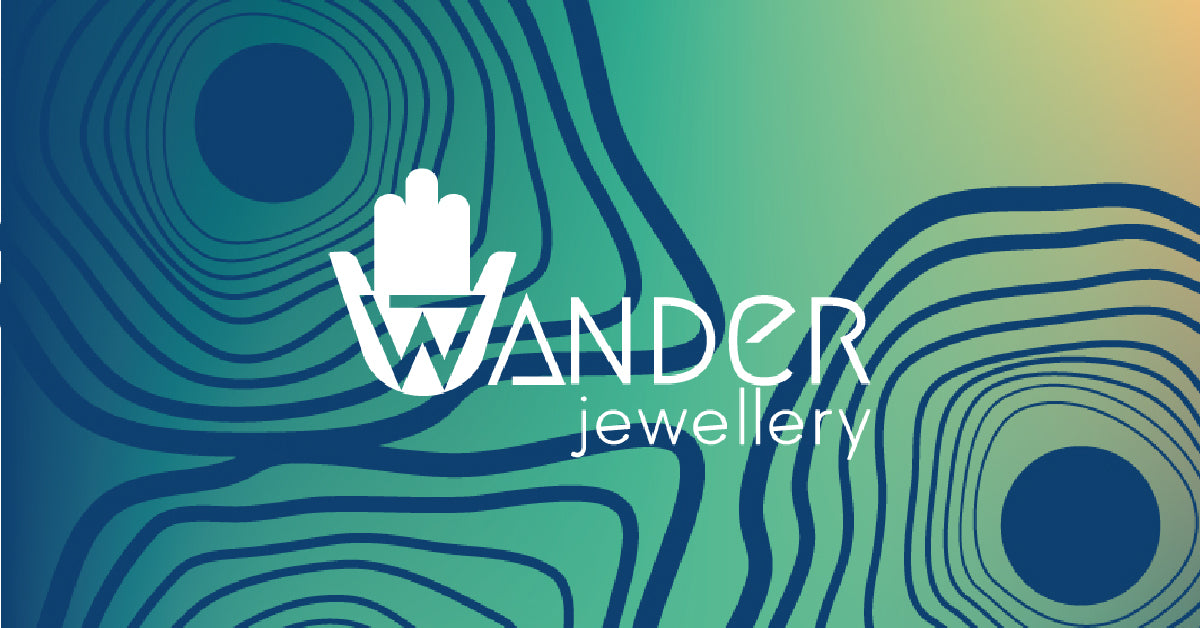
I followed the logic of referring to my origins and what's dear to me: the beach and the sea, which where a consistent background in my childhood. Not only did those colors give life to our pallet but also inspired the graphic imagery of wave-like lines that are present throughout our webpage, business cards and stationery. 
Extra tip: try to choose under three colors to be your main representative colors. You can have many more secondary colors to use across your brand but there must be a handful that truly represent your company.
Step nº3
Now you're ready to design you logo. This is a very important step as there is no doubt that the logo is one of the most recognizable aspects of a brand. It can be composed from text or it can be a symbol or it can be both (like in our case). The fundamental aspects to remember are:
- Represent your brands core value, the logo should reflect the essence of the brand.
- Keep it simple. We all want out logo to be memorable and unique and this often brings us to exaggerate but remember a logo has to be versatile and highly legible, the best way to attain this is to keep things simple.
- It's a good idea to design your logo in a vector format (e.g., Adobe Illustrator) to ensure scalability, that means you logo will look good printed on a tiny label or on a billboard. A good idea is to print out your logo in different sizes when you're trying it out, see how small you can go before it's illegible.
- Visual harmony is very important, as nature shows us again and again. It helps to create a geometric grid and try to built your logo in it.

Step nº4
Choosing your typeface. The fonts a brand uses in its marketing and product materials. Please note that the typeface you choose for your logo and the company's font don't have to be the same one. Imagine if all our website was written with the same font used in the logo. You wouldn't understand a thing! Here readability is key. Although it's also another way of expressing the nature of your brand. Typography helps set the tone, whether it's formal, playful, modern, or traditional.
Step nº5
Last but not least is the slogan. A very fun part of the process. A short, memorable phrase that captures the essence of the brand. It often accompanies the logo and is used in marketing campaigns. We use ours on the banner of our homepage to communicate how our jewelry shop was born during our travels and how every piece of jewelry we make conveys (we hope) fragments of cultures and colors of the world.


Leave a comment
All comments are moderated before being published.
This site is protected by hCaptcha and the hCaptcha Privacy Policy and Terms of Service apply.